Data Visualisation with Markdown, Flexdashboard and Shiny
In most data projects it is useful and necessary to visualize your data and your results. Different tools exist for this in the R-universe and it depends on your purpose what is most suitable for you.
In the following I will present some data visualization packages and tools that can help you to get the best visualization out of your data.
Visualisation tools
Base R visualization
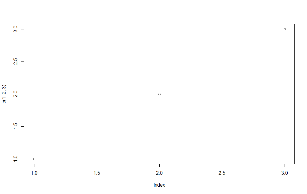
The most basic visualization can be done in base R. There is nothing more simple for quickly visualizing your data than the base R plots. For example for plotting some points in a graph one very short line of code is enough:
plot(c(1, 2, 3))

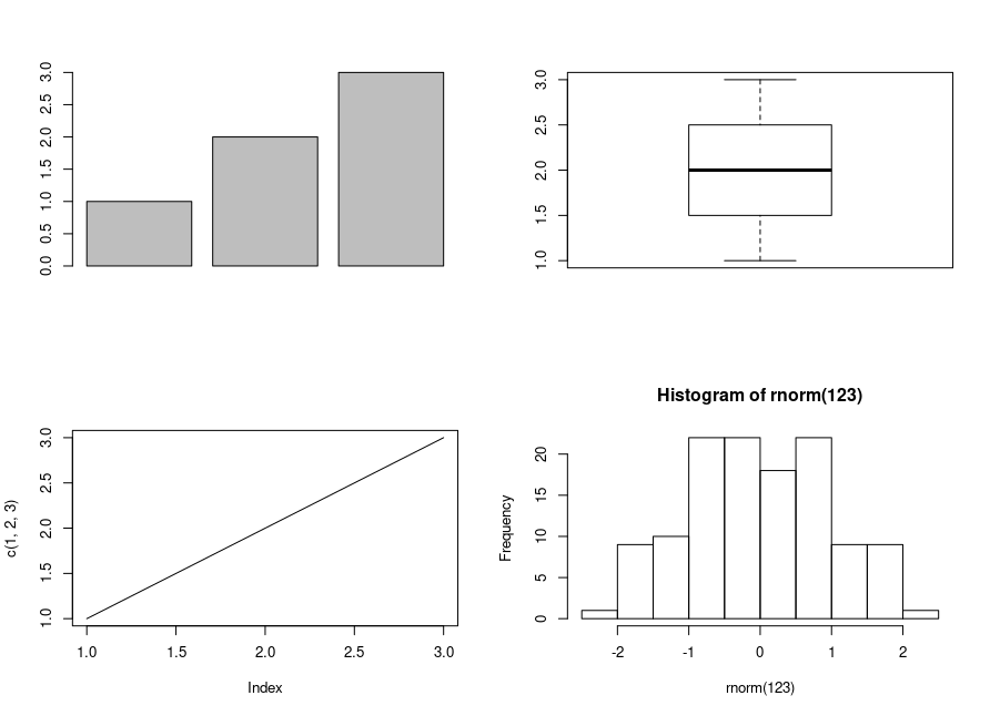
So for quickly looking at some data this is my first tool to go. You can quickly create histograms, barplots, boxplots, lineplots, etc. with no need for any additional package and with some very short lines of code.
par(mfrow = c(2, 2))
barplot(c(1, 2, 3))
boxplot(c(1, 2, 3))
plot(c(1, 2, 3), type = "l")
hist(rnorm(123))

ggplot2
If you are gonna show your plots to a bigger audience your plots should look more sophisticate. With some work you can also create some very nice plots with base R.
Nonetheless the R package ggplot2 can help you to create beautiful plots without a lot of work.
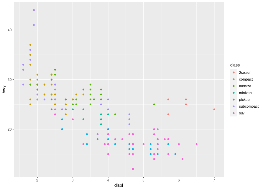
Here a simple example for plotting some points in different colors. More examples can be found on the official web page.
library(ggplot2)
ggplot(mpg, aes(displ, hwy, colour = class)) +
  geom_point()

The language is maybe sometimes not that intuitive (for me) as base R but once you learned the syntax a bit better it will not be difficult to create some very nice and beautiful plots.
plotly
For interactive html-Websites or dashboards the R package plotly is my first choice.
Plotly is available in R and in Python. On their website you can find a lot of examples that help you create the plots that you want.
The big advantage of plotly is that it is interactive. You can hover over plots to see the exact values, you can show or unshow certain groups by clicking on the group in the legend, you can zoom in into certain areas of the plot to see the values more exactly and much more.
Plotly is recommended for data and plots which are complex and especially for dashboards which are looked at regularly this is my first choice.
library(plotly)
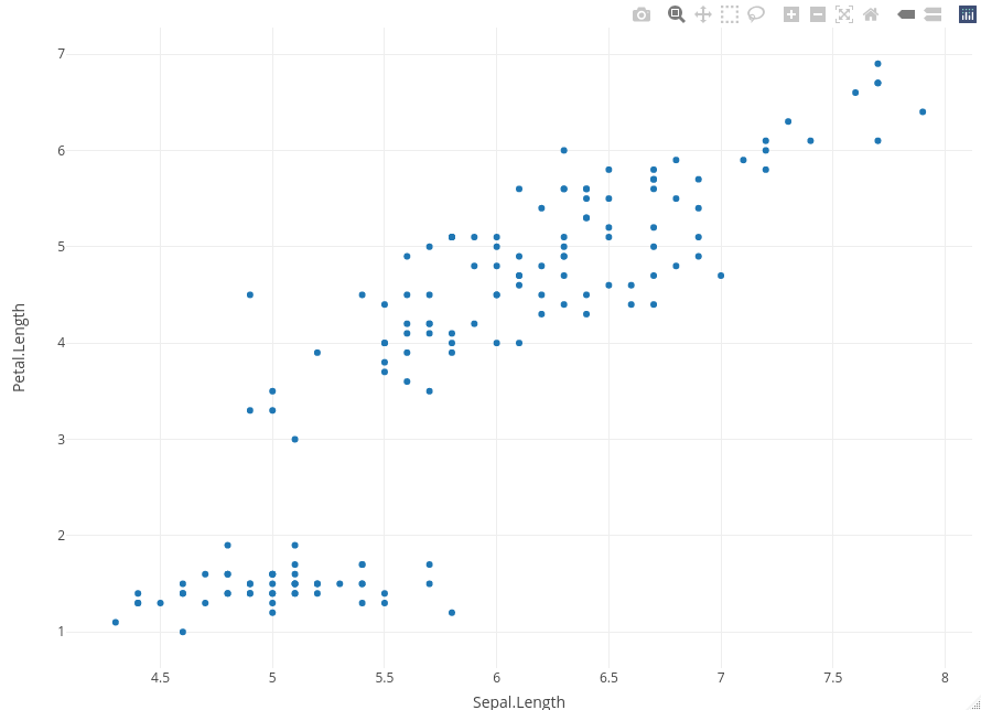
fig <- plot_ly(data = iris, x = ~Sepal.Length, y = ~Petal.Length)
fig

In this plot you cannot see the interactivity of plotly, because I saved the plot in the png format.
Tools for putting it in one place
When summarizing your data into a document either for having it all in one place or for showing it to others there are also different tools available.
I will here shortly present the three main tools that I am using.
R-Markdown
For putting your data analysis with text, graphs and code in one document R-Markdown is a very helpful tool. In R-Studio it is very easy to create a Markdown template to start with. Just go to File -> New File -> R Markdown and a template is created. You can create the output file by clicking on knit and then you can choose if you want to create a PDF, HTML or a word file.
More about the syntax and how to use it can be found on the official webpage
If you choose the html file you can even integrate interactive plots like plotly.
Shiny-App
For visualizing data in more dimensions and in a very flexible way, shiny apps are my preferred tool. You can create very flexible dashboards with shiny that help you to visualize your data and have everything in one place.
Some examples of shiny apps can be seen on the offical webpage.
Especially if you need to visualize your data regularly it can be a helpful tool to quickly look into your data.
Shiny is based on HTML, CSS and Javascript and can be adjusted if the standard shiny is not looking good enough (which never happened in my case).
Flexdashboard
Flexdashboards are something between a shiny app and an R Markdown document. You cannot create a complicated app with flexdashboard, but if you have just a few standard plots a flexdashboard is much simpler and faster to create than a shiny app.
Some examples can be seen on their example page.
Other tools
What are your favorite tools for data visualization in R? Did I forget to mention some tool that you can recommend and use regularly?